The human perception of time is logarithmic. We have words like second, minute, hour, day, week, month, year, decade, century, millennium etc. to refer to exponentially increasing time frames. But despite this fact, plots over time are usually in linear scale. When looking at values like the CPU load, the frame update time of a game, or the response time of a server, the last few seconds are of interest but at the same time the course of the last hours or days are valuable information. In order to display this range of time in appropriate detail, a linear plot is not sufficient.
Instead here, I introduce a combined linear and logarithmic plot. Short times are displayed in a linear time axis and longer time frames in (compressed) logarithmic time axis.
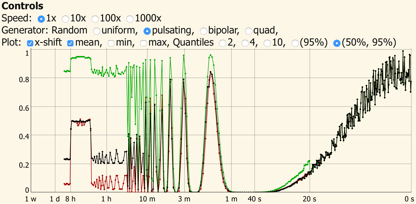
Example of the linear and logarithmic plot. Read the full article for a live demo.
One problem that arises when plotting is that in a week there are 604800 seconds. This would make updating such a plot very time consuming and impractical for responsive applications. To solve this, I reduce the time values in a logarithmic fashion by recursively combining two values to a single one. Combining two values to a single one is simple for the mean, the minimum and maximum value of a time series. In this case, the average, largest and smallest value of both samples which are to be combined are kept.
In the case of CPU load, the minimum over a time period will always be 0 %, the maximum will be 100 % and the mean value does not express sufficiently how heavily e.g. a web-server is loaded. Here, another value like the 95th-percentile of the load histogram gives an idea how much time the server spent under high load. The median (or 50th-percentile) usually coincides well with the mean, except when the distribution function is heavily skewed. In the case of a web-server the median can give an idea of the base load by background processes. Combining two histograms, however, requires a bit more thought than simply calculating the average of two values.
Read on for a live demo and illustrations which explain the method.
The Demo
The above demo illustrates the functioning of the logarithmic scaling. The linear scale goes until 20 seconds. For longer times the scale is compressed logarithmic to stretch from seconds to a whole week.
The controls above allow to increase the update rate from 10 per second at "1x" up to "1000x" to fill the diagram faster.
Different signal generators are available:
- The pulsating source shows that in this case, the median is much lower than the mean value but the 95 percentile is following the (short term) maximum closely and at the long term it gives a good representation of the "peak load".
- A uniform noise generator, a pulsating source and a 2 and 4 value random source. The uniform noise generator shows that the quantiles have an even stacking with the median coinciding with the mean value.
- The bipolar and quad generators show effects on the histogram with an uneven distribution. They are best viewed with 10 Quantiles.
- The "frame time" generator uses live data of the update time of the diagram.
With the "frame time", the time difference between two frames is taken and divided by 200 ms. The delay between two frames should be 100 ms, so the average value is expected to be 0.5. It is interesting to compare the behavior of different browsers. For example, Firefox uses a shorter delay after a update which took too long. This compensates the mean value almost perfectly and the histogram shows update times both, shorter and longer than the average. In Safari such a compensation is missing. Also when the frame is not in focus, interesting effects occur. Note: To use "frame time" properly the Speed should be set to "1x", unfortunately you cannot speed up real time to generate data faster. The time axis here is not in real time but calculated with increments of 100 ms regardless of the real delay. This could, of course, be changed by using appropriate x-values as input of the algorithm.
The display allows to switch on/off the mean, minimum, maximum values and to change the number of quantiles in the histogram.
The x-shift option adjusts the display position of the quantile data.
The JavaScript code for the demo is in the source of this page and in the file linlog_quantiles_sk.js.
Notes on the demo
The demo uses 20 quantiles internally and 40 data points to generate the initial histogram. Since the initial histograms are calculated "looking back" in time there seems to be a time difference between the mean value and the median value. This is compensated for by shifting the quantile data by 20 time values compared to the values in linear time and the mean data. Uncheck x-shift to see the effect. It is only used for the display and has no effect on the underlying data.
When changing the display properties, only the quantiles displayed are changed, in the background it is still 20 quantiles (equaling 21 values including minimum (the zeroth quantile) and the maximum (the 20th quantile)).
The calculation of the outer quantiles from a low number of data points is problematic. This is the reason why 40 points are used to calculate 20 quantiles. When displaying 10 quantiles with the uniform noise generator, they should converge toward 0.1, 0.2, ..., 0.9. and the median and mean values should be identical. In this demo there is still a small difference noticeable. For displaying rough data like CPU load, however, it should be good enough. When absolute precision is needed, it may be necessary to really store all data points and calculate the quantiles based on all data points (provided, enough storage and processing power is available).
The Implementation
Data structures
The following data structures are of importance:
- The quantiles are represented by an array
qwhich includes minimum and maximum.Nquantiles therefore are represented byN+1values.
- The histograms are represented by the corresponding values
vand a density or step heightd.- When two succeding values of
vare different, the corresponding value ofdrepresents the density between these values. - When two succeding values of
vare equal, the corresponding value ofdrepresents the height of the step. - The difference between
qandvis only in the interpretation.- When converting quantiles
qto the correspondingvanddvalues,v=qanddis adjusted that the integral between two succeeding values ofvis equal and the integral over the whole distribution function is 1.
- When converting quantiles
- When two succeding values of
- A data structure
log_datato hold the configuration and the values- The configuration consists of
num_quantiles: 20- The number of quantiles.
num_quantiles_first: 40- The number of quantiles for calculating the first histogram when inserting a data point which is then resampled to
num_quantiles.
- The number of quantiles for calculating the first histogram when inserting a data point which is then resampled to
division_factor: 2- The number of values which are combined when going to the next level.
num_levels: 40- The number of levels where data values are combined.
linear_num_keep: 200- The number of data points to keep at the first (linear) level.
level_num_keep: 10- The number of data points to keep in each level before combining the oldest.
- The levels contain
x- A vector with the x-values.
- Upon combining they are averaged.
y- A vector containing the y-values.
- Upon combining they are averaged.
- The first level contains the inserted data points. The later levels contain the mean values.
quantiles_with_minmax- The quantiles including the minimum as first value and the maximum as last value.
- The configuration consists of
Illustrations
The following figures illustrate the operations on the histograms.

Figure 1: A time signal with 9 points.

Figure 2: The time signal is sorted and used as q-values. The q-values are then used to calculate the histogram. The v-values are equal to the q-values and d-values are calculated accordingly. Between each pair of succeeding v-values 1/9th of the total density is assigned.

Figure 3: The integral over d results in the distribution function. It ranges from 0 to 1. Between equal v-values, a step with a height of 1/9th is present. Between different v-values a slope with the according steepness is present such that the integral increases by 1/9th for every value.

Figure 4: From the integral, a new set of q-values is derived. Here, 5 quantiles are taken from the histogram. The resulting q-vector consists of the minimum, 4 intermediate values and the maximum. This q-vector can also contain multiple entries with the same value when steps are present.

Figure 5: The addition of two histograms. The sum contains all v-values of the two added histograms. The d-values are added for the stretched parts in between different v-values. The integral over the result is 2, therefore it has to be scaled by 0.5 for further processing.
The functions
The function
quantiles_with_minmax_to_normalized_histogram( q ) -> [v,d]
is used to convert an array of quantiles into a histogram. It accomplishes the step when taking the y-values from Fig. 1 as q-values and produces the v-values and d-values in Fig. 2. In the demo, simply 40 values of the time series are taken, sorted, and then converted into a histogram.
In order to obtain the 21 v-values and d-values for 20 quantiles, the resulting histogram is then converted back to q-values. The function
histogram_to_quantiles_with_minmax( v, d, n ) -> q
integrates the histogram and extracts the v-values which correspond to the quantiles. See Fig. 3 and Fig. 4 for this operation.
In order to combine two data points, the quantiles are converted into histograms and added with
add_histograms( v1, d1, v2, d2 ) -> [v,d]
. This operation is illustrated in Fig. 5.
Since the resulting histogram does have an integral of 2, plus some numerical errors, the integral is calculated with
integrate_histogram( v, d ) -> integral
and the histogram is renormalized by scaling
scale_histogram( v, d, a ) -> [v,d]
and then converted back into 20 quantiles using
histogram_to_quantiles_with_minmax( v, d, n ) -> q
.
In order to acutally insert data, the configuration and intermediate values are stored in log_data and
log_insert_datapoint( log_data, x, y )
is called for each data point. (When 1000x is checked in the demo, it is called 10000 times per second.) This modifies log_data and with
get_log_values( log_data ) -> [ x, y, q ]
the vectors and matrices containing the corresponding values are retrieved.
Time scaling
For the time scaling the function
$$ x_{\rm{linlog}}\left(x_{\rm{lin}}\right) = \begin{cases} x_{\rm{lin}} & \text{when} \quad |x_{\rm{lin}}|<x_{\rm{linrange}} \\ x_{\rm{linrange}} * \left( p*\left(\ln\left(x_{\rm{lin}}\right)\right)^{1/p}-(p-1) \right) & \text{else} \end{cases} $$
with $p=10$ is used.
The values on the linlog-axis do not directly correspond to a meaningful quantity outside of the linear range. Automatically setting labels using a uniform grid will be misleading. Instead, the grid and scaling must be set considering the scaling function. In the demo, custom labels for appropriate times are added in the plot according to their linlog-values.
Conclusion and outlook
The demo shows that the principle works and i could implement it efficiently in JavaScript.
Possible areas for improvement are
- the algorithm which joins histograms,
- It is very fragile and could contain some badly handled edge cases.
- A thorough investigation could find and resolve all possible cases since it is not very complex.
- the algorithm which estimates the initial histogram,
- The outer values are definitely wrong.
- Probably some knowledge about the underlying probability distribution is needed to improve this.
- This is the place where the time shift is occuring.
- handling of numerical edge cases such as very small or very large values.
- Sometimes the integral over the added histograms deviates from the expected value. This could be a numerical problem or an implementation error.
Besides this JavaScript implementation, of course an implementation in Python, Matlab and C/C++ would be useful.
A good real-world application would be a system monitor displaying CPU load, RAM and other parameters.